

A1 Sound Systems
My First Real Brand Identity Project With Real Money
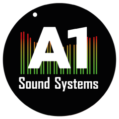
Final logo


...in general i believe a good logo come from a deep thought. that you can have while experiencing. hundreds of hours working in the field for that brand that you want to put inside a design. and therefore i also believe, that the main caricature of your design should come from the client, and my job as a designer is to milk it from the client so I'll be able to create an authentic shape for that particular cause, and in this project i knew right away that i want to implant the EQ colors somehow and i had a few attempts.
i should have begin with that: A1 is a high end service company for live concerts and studio recordings, and as you can guess they provide high end sound systems and sound services.
so the EQ colors and the client...
He really didn't want any color or any artistic view, and insisted on the most simple line of work and basic fonts and so my first attempt was his favorite but i had to continue to my favorite one, with the sound wave i created a visual that satisfied me, and the dot as a volume knob at 11 apparently the golden section for best sound by sound engineers.
What i basically did is using Aharoni bold font, the most basic font there is, i created a shapeout of it and cut the 1 anchors to make it more straight and simple rounded the corners and adjust the upper part of the 1 to fit my eyes better, and than i started to play with the colors and there you can see the 3 takes i had on it.


